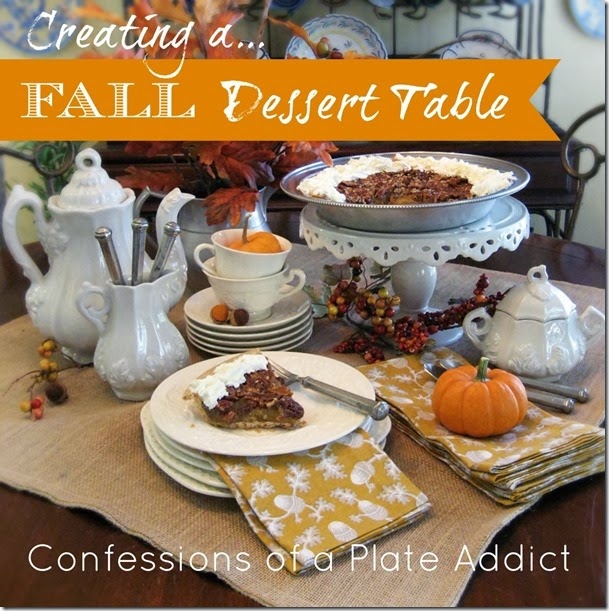
 I am so excited to be a part of the very first tour from all of us at The Scoop linky party…The Scoop on Creating Fall Vignettes! We plan to host monthly tours with a little different twist. We are asking a group of very talented bloggers to join us and share their secrets…and this month it’s how to create a vignette with a fall theme! I don’t claim to be an expert, but I can give you a few of my favorite tips. And I chose one of my favorite subjects today…dessert!
 Our co-host for today is the lovely Miss Kitty, who is actually quite the expert on vignettes since she has been posing in them long before I had a blog. It's one of her favorite things to do.
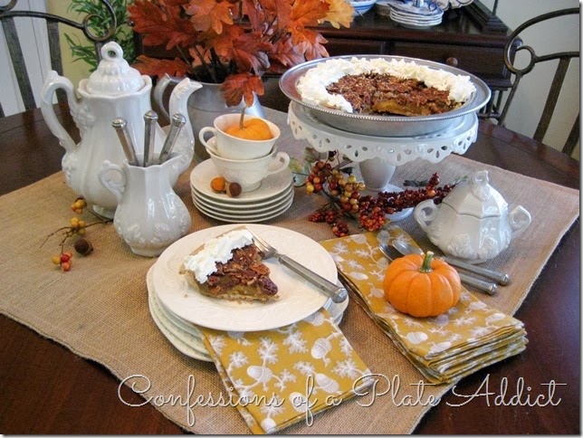
 Please understand that I have had no training. I am just giving you a peek at things through my eyes. And be warned…I am no minimalist so I will be stacking on the plates! Sooo…here we go! When I am working on a vignette, I like to start with something as a base…a mantel, a table top, or in this case...my burlap table square. It just pulls everything together. Next, I find a color scheme that complements my theme. It’s fall, so pops of orange and gold on white look crisp and just say autumn to me.
 Next, you need an anchor piece. This is a dessert table…so dessert is the star! I live in Georgia and grew up with a pecan tree in my yard, so I can’t have fall without pecan pie! I put it up on a cake stand to give it more presence.
 It’s important to vary the height to give your vignette interest. In my mind’s eye, I see triangles to help me achieve that look. In this vignette, I see two triangles.
 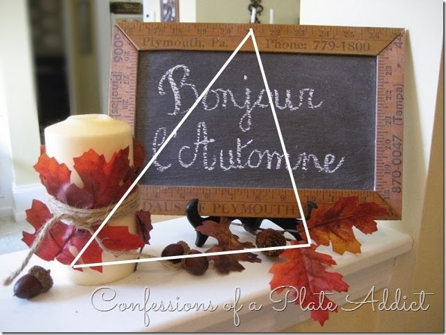 In a smaller one, I would go with just one. I find triangles pleasing to the eye.
  You can see that I have also paid attention to the handles. I like to have them pointing to the outside of the vignette and the items turned slightly toward the center. The tines of the forks are pointing to the center as well. This little trick seems to pull your eye into the vignette.
 I love to have a contrast in textures! I like the look of the nubby burlap next to the smooth ironstone and the patina of the pewter flatware. My favorite combination is rustic with elegant…can you tell? You will also notice that I follow (most of the time, but not always) decorating's # 1 rule…the rule of threes or odd numbers. See the three forks in the creamer…
  ...and the three pops of fall color? But...there are only two cups because I liked the way the handles look going opposite directions. Another one would spoil that. Honestly, it’s not that I count things…it’s just what is pleasing to my eyes.
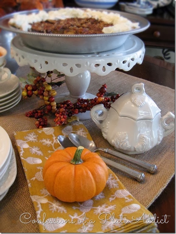 I also added print napkins for a little interest…but in colors that complement my fall color scheme and are simple and not jarring to the eye.
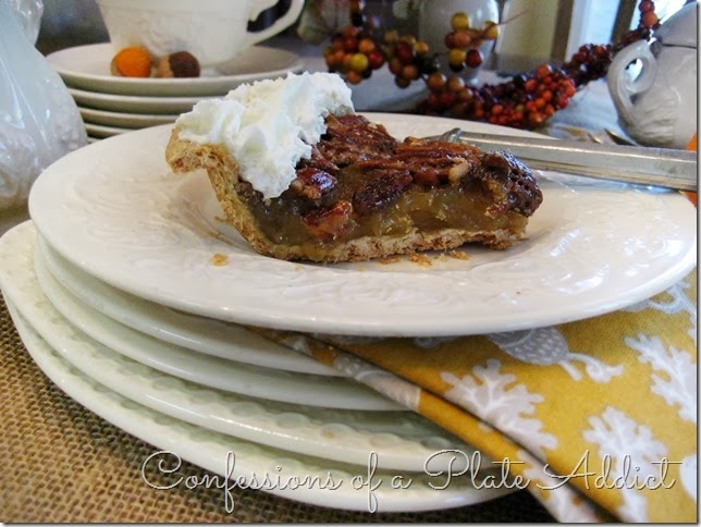 I like to vary the shapes as well. Even in this stack of plates, some are round and some are square. Adding the napkin in between adds a little interest and keeps them from looking like pancakes! Of course, you must have a slice of pie on top!
  So there you have it…a (maybe a little scary) peek at how my mind works when I am creating a vignette! As I said…I am no expert...I just know what pleases my eyes. I hope that may have helped you in some way. But just smile and say “she surely does love her plates and her pecan pie” if not! lol
Thanks for stopping by! I hope you enjoyed having a little peek at my fall dessert table! Please visit these wonderful bloggers and their beautiful blogs to see what they are up to and to find a list of this week’s participants!
Under the Table and Dreaming for the Sunday Showcase Party , Thrifty Decor Chick for Before and After Monday , Between Naps on the Porch for Metamorphosis Monday , The Stories of A2Z for Tutorials and Tips Tuesday , Coastal Charm for Nifty Thrifty Tuesday , A Stroll thru Life for Inspire Me Tuesday , My Uncommon Slice of Suburbia for Tuesday's Treasures, Savvy Southern Style for Wow Us Wednesdays , The Shabby Creek Cottage for Transformation Thursdays , No Minimalist Here for the Open House Party on Thursdays , Stone Gable for Tutorials, Tips and Tidbits on Thursdays , My Romantic Home for Show and Tell Friday , French Country Cottage for Feathered Nest Friday , Common Ground for Be Inspired on Fridays , The Charm of Home for Home Sweet Home Friday , Craftberry Bush for the Inspiration Gallery on Friday , Funky Junk Interiors for Saturday Nite Special, Tatertots and Jello for the Link Party Palooza
See you next time! À la prochaine!Also find me at…


0 comments:
Post a Comment